
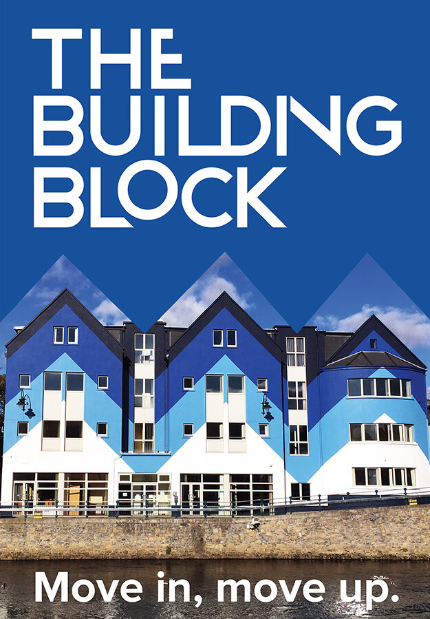
THE BUILDING BLOCK
Presenting a new way of working in a regional town

Brand values & Positioning
Name, tag lines, copy
Visual identity
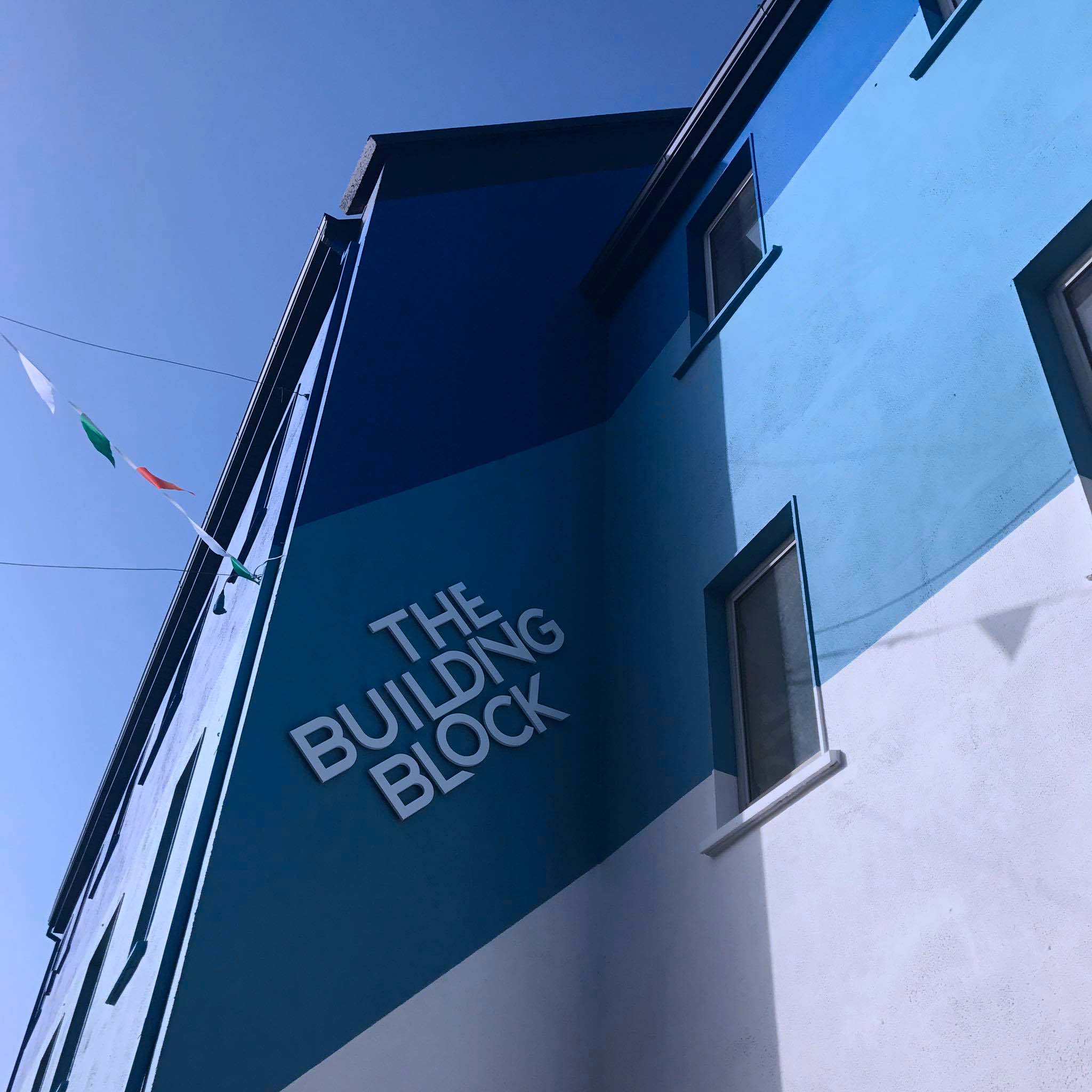
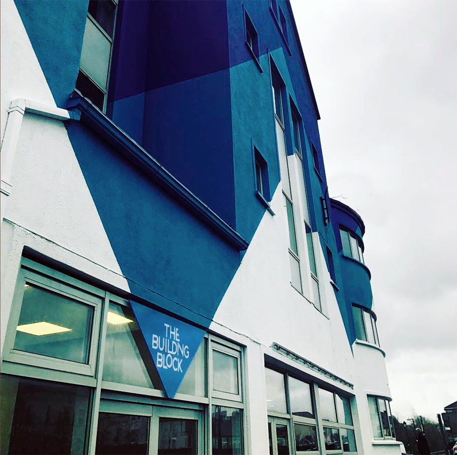
Signage & print collateral
The brief here was to develop a brand identity for an exciting work/educational hub in Sligo. Stakeholders included the developer/architects alongside the IDA and SligoIT.
Office stock in Sligo town was at odds with the ambition of the growing business community in the tech and creative sectors there. The Building Block was the first place to offer a design-led, highly specced place for co-working and small/medium businesses. We were not merely naming a building or a corner of Sligo town but developing an impetus and ambition for business in Sligo and the North-West.
THE NAME
Working from our brand values, we identified a requirement for a name that would convey growth and progression with a relaxed TOV. We were also, in effect re-branding a physical location in the town, so the name needed to feel right as an address.
TAGLINES
Ambition has a new address
Move in, Move up

THE VISUAL IDENTITY
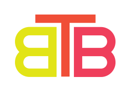
The logo we created is architectural and modular - providing facility for various configurations, reflecting the nature of The Building Block working spaces; considered, functional design. The way in which the letterforms fit together and support each other suggests co-operation.
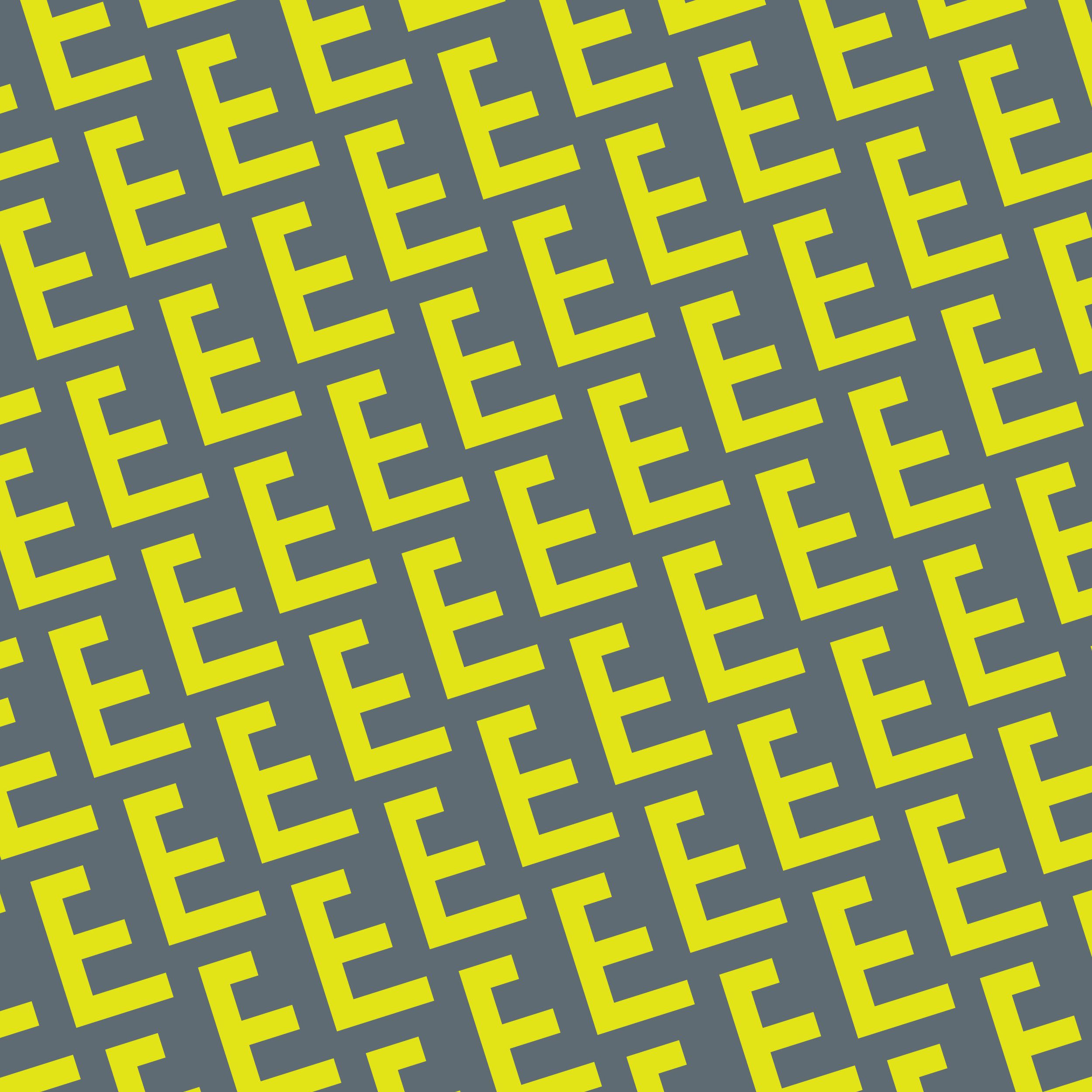
A suite of supporting pattern graphics were based on letterforms from the logo, communicating the excellence, energy and connectedness of the enterprise and giving us a broader visual language with which to communicate the brand message. The colour palette, founded on the striking exterior paint-job, is vibrant and modern.
A monogram - TBB - provides a short form of the brand name but also illustrates the enterprise; the T representing a table and the Bs chairs/workers.


The Building Block has been fully occupied since launch.