FiXX
Finding a singular identity in a busy marketplace

Position & tone of voice
Visual Identity & tag-line
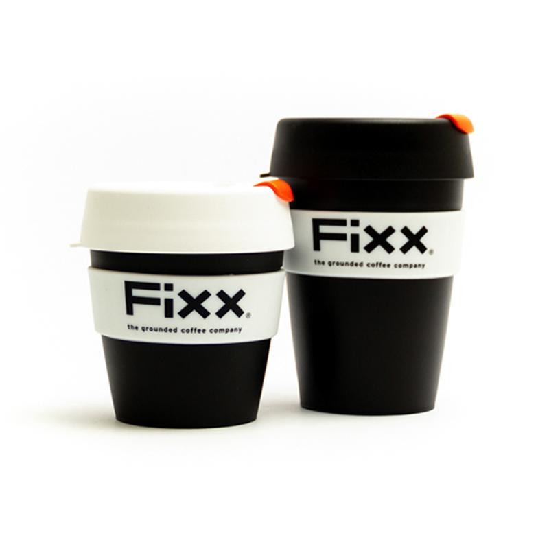
Packaging
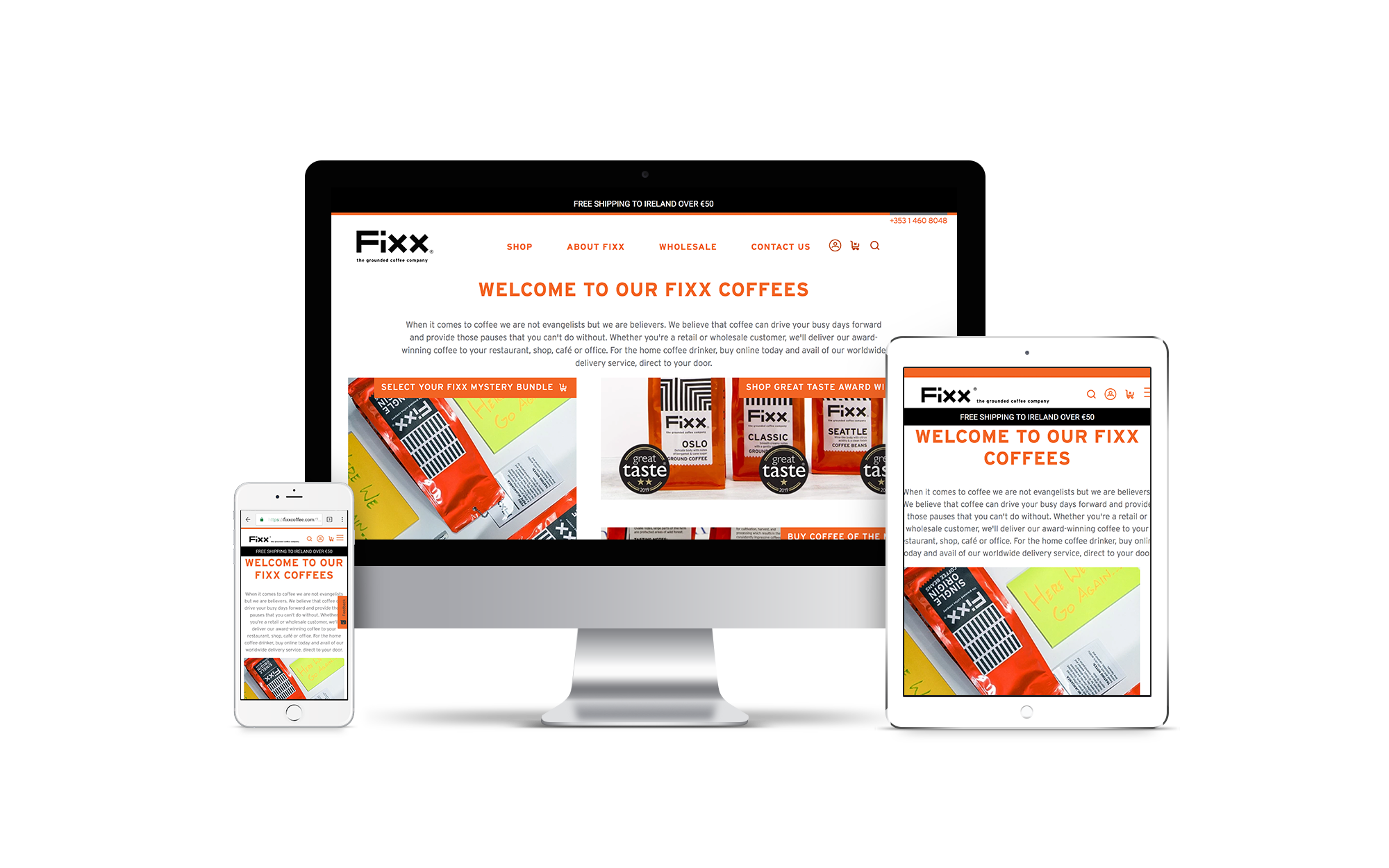
Web visual direction
We had worked with Hancock & Abberton for over 10 years when they decided to align their disparate coffee brands under the Fixx banner. This relaunch required some deep positioning work to clarify and solidify the brand as an unpretentious but premium offering.
The Fixx word mark is based on a single rectangular bar shape, which is stacked, clipped and rotated to build the four letter forms. This bold, functional approach is anchored in the values we developed with Anne Abberton and the Fixx team.
The tag-line is equally bold and functional in approach.
We also worked with the team on determining how the full range would be named and presented under the new umbrella name. So we took our basic bar shape and created a range of patterns to distinguish each blend;
Straight up and down bars for CLASSIC. Bars creating square (poetic licence for cube) shapes for CUBANO. Veins of a leaf in bars for ORGANIC. Diagonal ‘No’ bars for DECAF. A grid of Ajuzelo tiles from overlapping bars for LISBON. A Danish flag of bars for OSLO. Slanting bars of rain for SEATTLE and a lot of ‘1’ bars for SINGLE ORIGIN.

The website is designed to be a place for coffee drinkers to feel comfortable and un-judged. It’s easy to make a purchase and the tone-of-voice is ‘no bull-shit’, as per FiXX brand values.